
And why it might be time for a website makeover.
Who Are Mobile Users?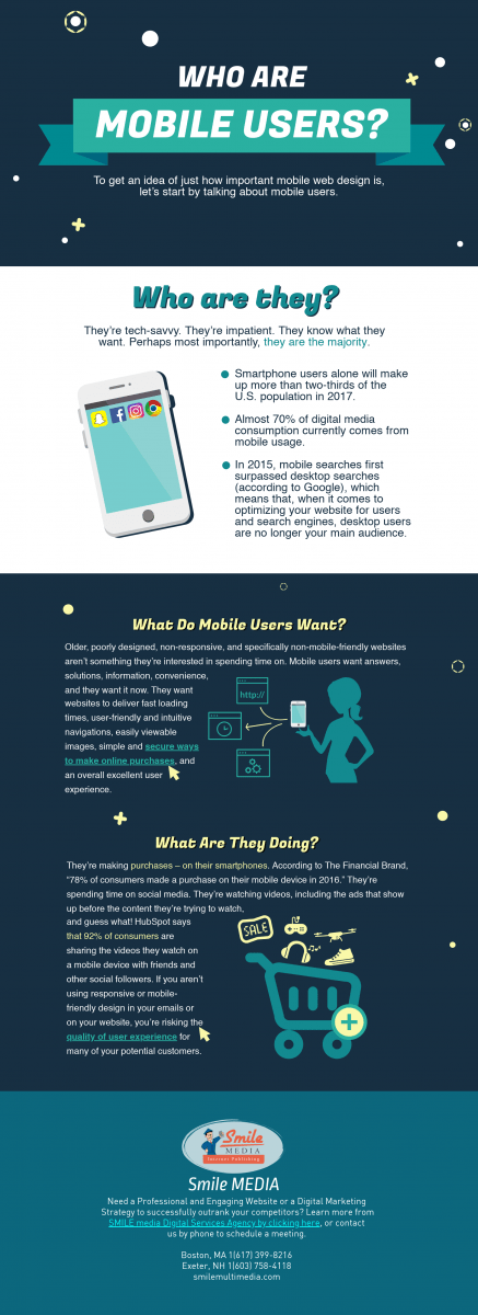
To get an idea of just how important mobile web design is, let’s start by talking about mobile users. Who are they? They’re tech savvy. They’re impatient. They know what they want. Perhaps most importantly, they are the majority. Smartphone users alone will make up more than two-thirds of the U.S. population in 2017, according to this year’s eMarketer Report. According to comScore’s report, “2017 US Cross-Platform Future in Focus,” almost 70% of digital media consumption currently comes from mobile usage.
In 2015, mobile searches first surpassed desktop searches (according to Google), which means that, when it comes to optimizing your website for users and search engines, desktop users are no longer your main audience. While many mobile users also access the internet via additional devices, like desktops or laptops, approximately 15% of internet users will use only a mobile device for online access in 2017. This percentage will likely continue to rise as additional users adopt mobile devices and slowly let go of their desktops and laptops as a means of accessing the internet.
What Do Mobile Users Want?
Mobile users want answers, solutions, information, convenience, and they want it now. They want websites to deliver fast loading times, user-friendly and intuitive navigations, easily viewable images, simple and secure ways to make online purchases, and an overall excellent user experience. Older, poorly designed, non-responsive, and specifically non-mobile-friendly websites aren’t something they’re interested in spending time on.
Mobile users also want a seamless transition from their desktop experience to their mobile experience. They don’t want two completely different versions of your website. While this may have worked in the past, mobile users today expect more from your website. Period. They want the same quality and type of experience when using your website, regardless of what device they are viewing it on.
What Are They Doing?
They’re making purchases – on their smartphones. According to The Financial Brand, “78% of consumers made a purchase on their mobile device in 2016.” They’re spending time on social media. They’re watching videos, including the ads that show up before the content they’re trying to watch, and guess what! HubSpot says that 92% of consumers are sharing the videos they watch on a mobile device with friends and other social followers.
They’re also reading emails. According to Litmus, the percentage of emails opened on a mobile device has gone up by 8%, to 56%, which means more than 50% of emails are being read on a mobile device. This also means that, any links to your website that may be included in your email campaigns are likely to be viewed on a mobile device as well. If you aren’t using responsive or mobile-friendly design in your emails or on your website, you’re risking the quality of user experience for many of your potential customers.
Tips to Meeting Mobile User Needs
Now that you know who mobile users are, what they want, and what they’re doing, let’s talk about what that means as far as your website or other online applications and marketing campaigns go.
1. Speed Matters.
Your website better load quickly, regardless of whether a user is accessing it via desktop or a mobile device. Why? Remember when we said that mobile users are impatient? Anything longer than 2, maybe 3 seconds if you’re lucky, and you may lose that visitor forever. Keep files sizes small (especially images), and keep text simple.
2. Image Quality Matters.
Are your images clear on a mobile device, but blurry on desktop, or do they not load at all from a mobile device? Be sure to work with high quality images and to size them accordingly so that mobile users aren’t being penalized for having a much smaller screen.
3. Readability Matters.
These days, businesses spend a lot of time on developing quality and relevant content for their website. They create blog posts, articles, eBooks, other downloadable and shareable content to provide resources to potential customers, and generate leads. However, if your content isn’t easily viewable from a mobile device, your mobile users will get frustrated, and may go elsewhere to find what they’re looking for.
4. User Experience Matters.
Mobile users want a better website user experience, and unsurprisingly, Google wants them to have that better experience, too. Google cares about whether your site is designed mainly for desktop users. In fact, they recently started crawling and indexing sites based on the mobile version of your site. If a user’s experience on your mobile website isn’t as fast or as easy as it might be on your desktop website, you’re not just disappointing your human visitors; you’re also disappointing Google. If your mobile site loads more slowly than your desktop site, Google may penalize you for this, even if your desktop version loads at lightning speeds.
Time for a Website Makeover?
Website design can be difficult, and daunting, especially if it’s not your area of expertise. It involves a lot of moving parts, and a lot of time. While you can make some simple changes to make your website more mobile-friendly, there are some aspects of responsive and mobile web design that are best left to a professional. If you need help getting your website ready for today’s mobile users, SMILE can help. Contact us today for an assessment.
**Test Your Website**
If you’re not sure if your website is mobile-friendly, you can test it using Google’s mobile-friendly search console tool.


